Here we are at the final stage of the MVP. Before we get into the visualisation piece, it’s worth reminding ourselves what this whole thing set out to do.
- Ingest Fantasy Premier League data and predict player points.
- We tackled this with an XGBoost model, and the results were solid enough to show the approach works.
- Build an end‑to‑end data platform in Databricks.
- We pulled data from the FPL API, cleaned it, and landed it into a proper medallion architecture in Databricks. It’s now a reusable lakehouse for anything Premier League related, not just fantasy.
- Use Power BI to visualise what the model is actually telling us.
- That’s the focus of this final blog.
As this is only an MVP, I am not building a full set of reports – just a couple of pages to tie the whole project together. A productionised BI suite will come in the next iteration, when I convert the whole project to Fabric.
I plan to use Tabular Editor to build and maintain a clean semantic model, and the dashboards using it will be extensive and give insight on not just Fantasy, but everything Premier League.
You can go back to the case study here.
Visualisation Best Practices – Overview
This blog isn’t about how to build the best dashboards – that is a whole case study in itself!
What I can do here is lay out the principles that matter every time you open Power BI and start dragging visuals around.
- Substance over style
- If you can’t justify a visual, label or piece of text, delete it. The whole point is to reduce noise so the message comes through clearly. High data‑ink ratio, low decoration.
- Always answer one question
- Every report page should be centred on one specific question it is trying to answer for the user. If you cram too much into a page, the core message gets lost. 3-5 visuals is usually right.
- Draw the users’ eyes
- People read screens in an ‘F’ or ‘Z’ pattern, so put your biggest insights and KPIs where the eye lands first. Don’t bury the lead KPI or graph halfway down the page.
- Choose the right visual
- Use visuals that actually help explain the point. Bar charts beat pie charts. Line charts beat fancy radial nonsense. This article is great for helping you choose when to use certain graphs.
- Use whitespace
- Whitespace is breathing room. It separates sections, creates structure and helps the viewer follow the story. If a page feels cramped, split it across two.
- Consistency
- Fonts, colours, borders, spacing. Keep them consistent. These small details make the whole report feel trustworthy and professional. They’re the last 2 percent that most people skip but make the biggest difference. Take pride in delivering a polished report that you know is pixel perfect!
Now, let’s apply these to a dashboard in Power BI.
The connection is Import mode, straight from the gold layer in Databricks. All the DAX lives here in the model so the visuals stay clean. All pages can be sliced by date, gameweek, team, player, position, season or fixture.
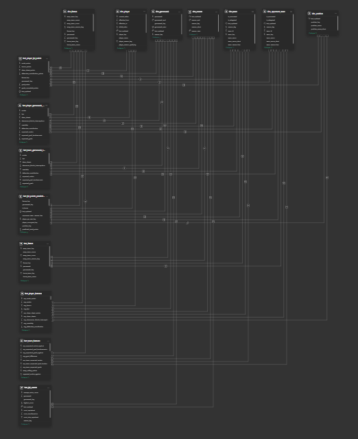
If you ever need reminding why you should model your data properly in the lakehouse instead of hacking it together in Power Query, this semantic model says it all. Power BI auto‑detected most of the one‑to‑many relationships between facts and dimensions because the naming and formats already lined up.
The shape also shows the enterprise bus matrix coming to life, with dimensions across the top and facts down the side (You’re not meant to zoom in and inspect every table!). The point is that when the data is designed well, the model almost builds itself.
Page 1 – FPL Prediction Performance
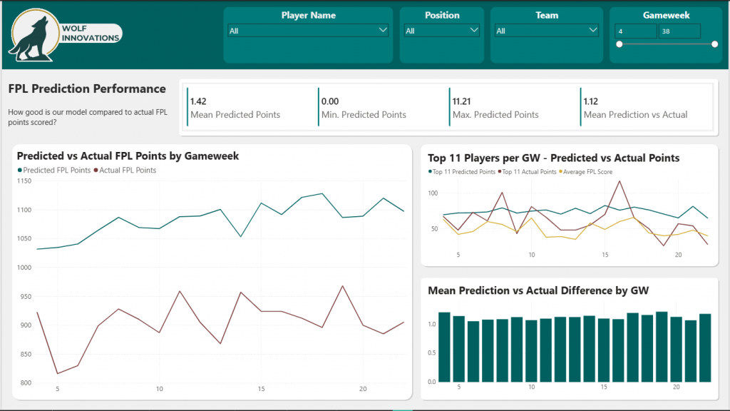
The first page is built around one question: How good is our model compared to the actual FPL points scored? Notice I put the question directly into the subtitle. It keeps the user anchored to what they’re looking at.
The KPIs at the top give us the headline. Mean, min and max predicted points all look sensible. We never dip into impossible negative predictions. The max of 11.2 is within reason for a normal gameweek. The mean is under the 2 points players get just for hitting 60 minutes, which shows the model isn’t inflating anything by default. The mean absolute difference between predicted and actual is also there to set expectations.
We then have 3 graphs.
The first is the predicted vs actual points aggregated by gameweek. We’re consistently about 20 percent over across the board. Not disastrous, but something to tighten as the feature set grows.
Following the F‑pattern, the next visual is important. It compares the top eleven predicted players each week with what that team actually scored, plus the average FPL manager score for context. Across the nineteen gameweeks we’ve predicted so far, our top eleven were outscored by the average player only five times. And whenever it did happen, it was only by a few points. It’s crude, because it ignores formation rules, club limits and budget, but as an early sanity check, it’s solid. If we’d blindly picked the predicted eleven each week, we’d have done pretty well.
The final chart shows the average absolute error per gameweek, which sits at 1.12 points. For a first pass model, that’s not bad at all.
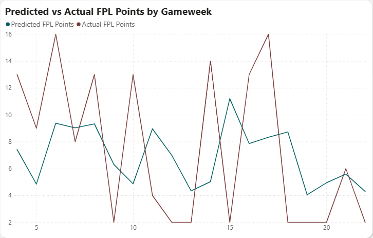
Let’s dig into this a bit – we can isolate the main graph and check out how our predictions compare to actual points for Erling Haaland, the highest scorer in FPL this year.
As you can see, the trouble with trying to predict something like individual performance is that football is unpredictable! Haaland either scores 2 or 3, or doesn’t contribute! We are consistently predicting 5-9 points a week, but it’s either 2 or 15 when it comes to Haaland!
Page 2 – FPL Predictions – Top 20
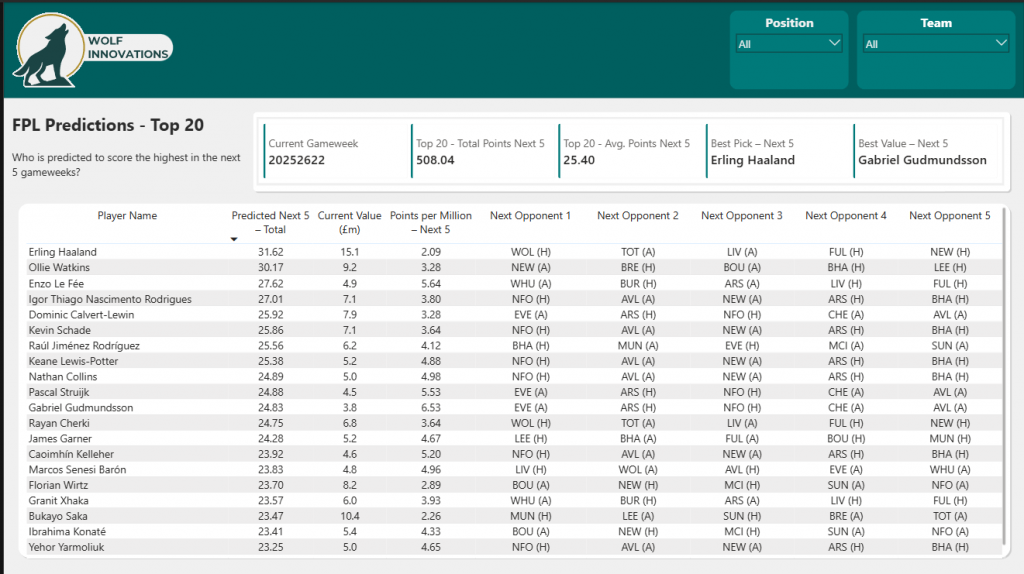
This page answers a simple question: Who is predicted to score the highest in the next five gameweeks?
At the top you’ve got a small set of KPIs that summarise the model at a glance. Current gameweek, the total predicted points for the top twenty players, the average per player, plus two quick picks: the best overall pick and the best value pick.
The main visual is a ranked table of the top twenty players based on their predicted five‑week total. Each row gives you predicted points, cost, a points‑per‑million metric, and the next five opponents so you can sanity‑check the fixtures. The table does exactly what a table should do. It lets you scan, sort, and compare without overthinking it.
The fixture columns work well because they ground the predictions in something familiar. You can instantly see why a player might be ranked high or low.
We can also use the slicers to filter to particular teams or positions.
At this point, there is no context such as injuries, manager changes or knowledge of fixture build-up (leading to resting players), so there is still a bit of common sense needed before blindly adding some of these players.
Summary
That’s all, folks! I’ve enjoyed building this MVP and writing about it.
With regards to FPL, I might just play my wildcard this week – the model looks fairly good and I need a bit of help to close the season on a high! As of writing, I am 2millionth (out of ~12 million) in the Overall rankings, and midtable in most of the leagues I am in. I’ll keep you posted on where I end up!
We are a long way off a complete solution. I will continue to improve, refactor, add and experiment to this, and tour it around various Meetups showcasing how powerful using your data can be!
Some of the current limitations of the setup are:
- No injury, manager or even timing/weather context data in the model.
- No true Team Of The Week which follows all of the constraints of the game.
- Not fully automated – I have to pull the trigger when I know the gameweek is over.
Next steps:
- Convert the whole project to Fabric.
- Full automate the triggers to run the pipeline.
- Modularise helper functions into python wheels.
- Add a proper CI/CD process.
- Document all aspects of the project for governance.
- Add a data agent and alerting to not even need to look at a dashboard!
- Add additional insights into players, teams and the Premier League – we have a rich dataset on every stat per player per gameweek – I am sure there are many more patterns to find!
Thanks for coming with me on this journey.
If I feel I have something to say, I will be posting a mix of technical guides, trialling preview features and ramblings about business and data on my website and LinkedIn.
BW


